Why Your Video Looks Different Online (And Why That's Totally Normal)
You approved the colour in the studio. It looked perfect. Then you watched it on your phone and thought, "Wait… did someone change something?"
Nobody touched it. We promise. But we get this question a lot — so let's break down what's actually happening, no film-school degree required.
The Short Answer
Every social media platform squishes your video to make it load faster. That squishing — technically called compression — changes how colours look. Think of it like photocopying a photograph. The copy is close, but it's not quite the original.
The version you saw in the studio? That's the original photograph. The version on Instagram? That's the photocopy. And TikTok? That's a photocopy of the photocopy.
So What Exactly Happens When You Upload a Video?
When we deliver a finished video, it's a big, beautiful, high-quality file — like a freshly baked cake straight from the oven.
The moment you upload it to YouTube, Instagram, TikTok, or any platform, that platform takes your cake and squashes it into a lunchbox. They do this so it loads quickly on everyone's phone, whether they're on Wi-Fi or sitting on a bus with one bar of signal.
The problem? Some of the icing gets smudged in the process. Colours shift slightly, dark areas lose detail, and bright, punchy tones can get a little muddy. Every platform squashes differently, which is why the same video can look slightly different on YouTube versus Instagram versus TikTok.
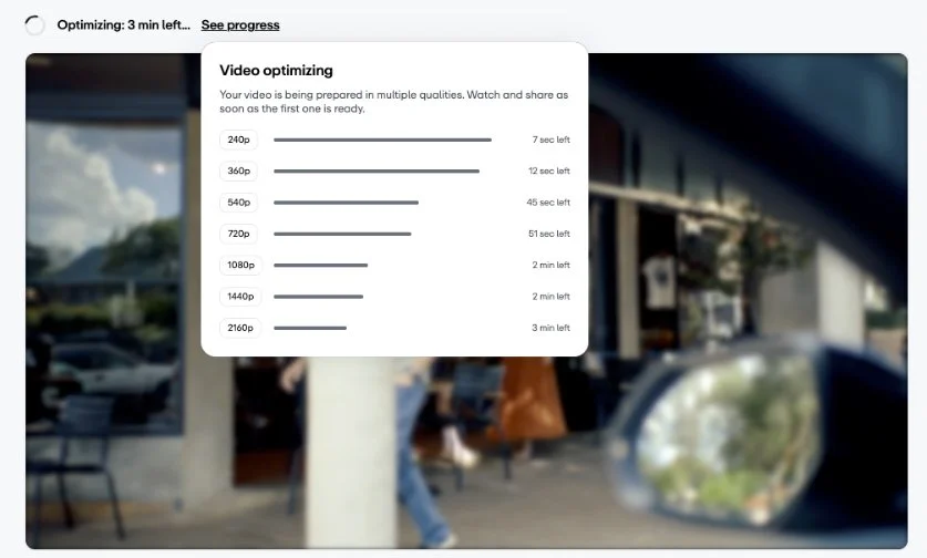
Vimeo platform optimising video for playback
Not All Platforms Are Created Equal
Here's a rough ranking of how well each platform preserves what we created for you:
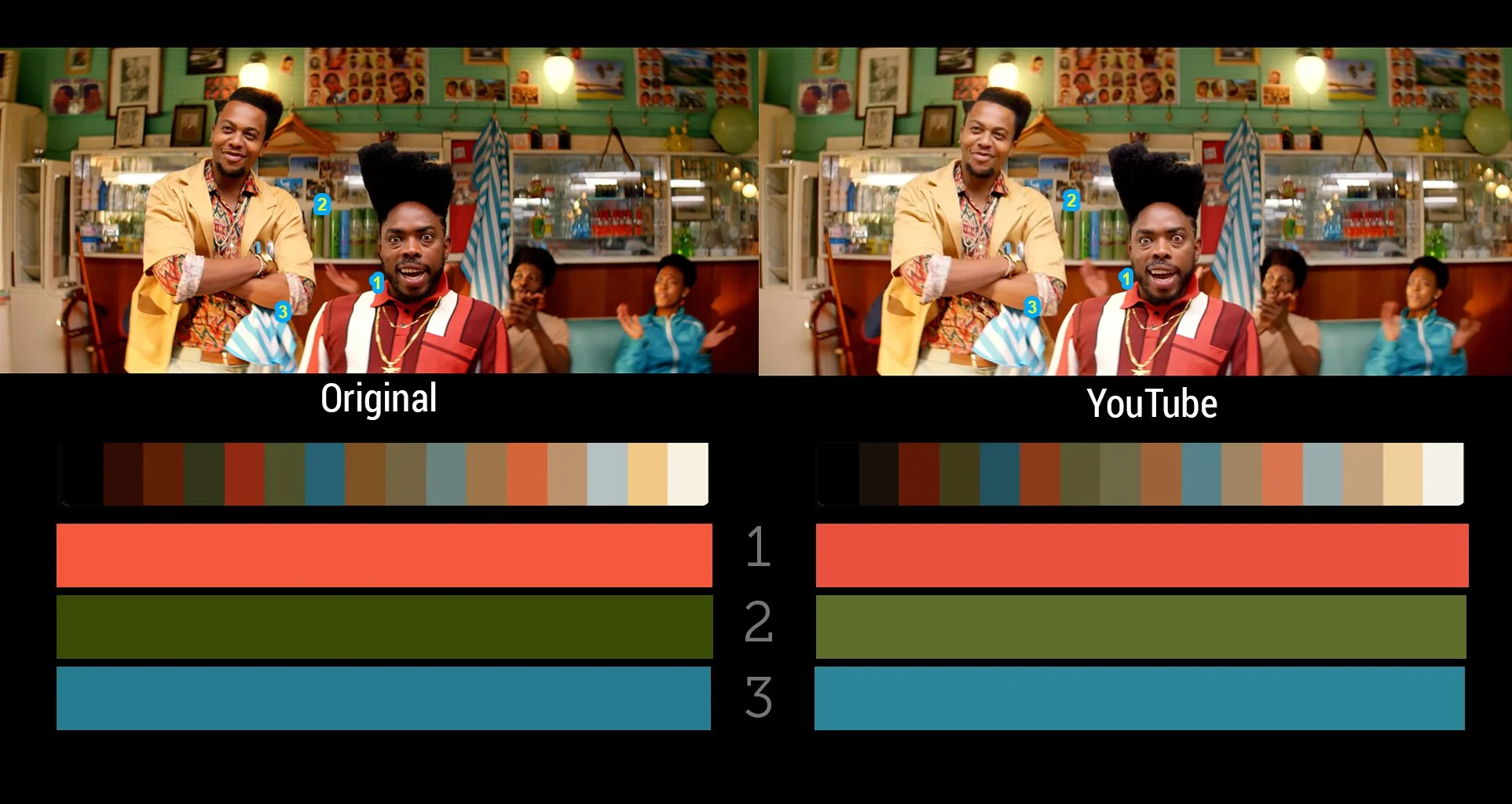
🥇 YouTube — The gold standard. Least amount of squishing. Closest to what you saw in the studio.
🥈 Facebook — Pretty decent, especially for landscape videos in the feed.
🥉 Instagram — More aggressive compression. Colours can shift slightly warmer, and dark tones lose a bit of punch.
4️⃣ TikTok — The most aggressive of the bunch. Compresses heavily to keep things snappy on mobile.
5️⃣ X (Twitter) — Compresses hard. Fine detail and gradients suffer the most.
Pro tip: Uploading from a computer (desktop browser) instead of the phone app usually gives you better quality on Instagram and TikTok. The mobile apps compress your video before it even reaches the platform.
Your Screen Is Also Playing Tricks on You
Here's the other piece of the puzzle: not all screens show colour the same way.
Your laptop, your phone, your office monitor, and the TV in the studio are all displaying colour slightly differently.
A MacBook screen tends to look vibrant and punchy. A budget office monitor might look a bit flat and dull. Your phone at full brightness in sunlight will look completely different to your phone in bed at midnight with Night Shift on.
When we colour your video in the studio, we use calibrated monitors — screens that have been tuned to show colour as accurately as possible. It's like a perfectly tuned piano versus a piano that's a little off-key. Both play music, but one is precise.
So when you watch the final product on your phone and think the colours look "off," it might not be the video at all — it might just be your screen interpreting things a little differently.
TVC: Halls ‘Barber’
Some Colours Are More Dramatic Than Others
Compression doesn't treat all colours equally. Some handle the squishing gracefully. Others throw a tantrum.
🔴 Reds — The diva of the colour world. Bright reds are notorious for looking blocky and blotchy after compression. If your brand colour is red, we're already thinking about this during the edit.
🟢 Greens and cyans — Can shift or develop a slight fringe. You might notice this in graphics or lower thirds.
🔵 Deep blues and neons — These love to band and break apart, especially in smooth gradients.
🤎 Skin tones, earth tones, and pastels — The well-behaved kids. These survive compression the best because, fun fact, video compression was basically designed around making human faces look good. (Seriously.)
What We Do About It
We don't just export and hope for the best. Here's what happens behind the scenes:
We export at a higher quality than the platform requires. We give the platform a pristine source file so that even after it does its squishing, the result still looks great. Think of it as sending your cake in premium packaging so it arrives looking as good as possible.
We use the right colour settings. We export in the colour space that screens and social platforms expect (Rec. 709, if you're curious), so there are no translation errors along the way.
We watch for problem colours. If we know a video is heading to social, we keep an eye on those diva reds and moody blues during the colour grade to make sure they'll hold up.
We can create platform-specific versions. If colour accuracy is critical for your project — say, a fashion campaign where the exact shade of that dress matters — we can create tailored exports for each platform with subtle adjustments to compensate for each platform's quirks.
The Takeaway
The colour you see in the studio is the true colour of your video. That's the reference point — the master version. What you see on social media is that version after it's been through the platform's compression machine and displayed on whatever screen you happen to be using.
It's like listening to a song in a recording studio versus through your car speakers versus through your earbuds. Same song, slightly different experience every time..